
- Email us
- sales@dexusmedia.com
- Call us
- +918426833930
With the increasing use of smartphones and tablets to access websites, it’s essential that your site is designed to look great and function smoothly on any device. At Dexus Media, we specialize in providing responsive website development services in Jamshedpur, ensuring your website is fully optimized for all screen sizes, from desktop to mobile.
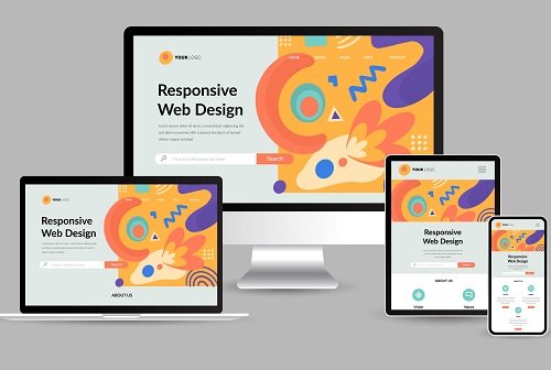
The responsive website adapts to different screen sizes and resolutions, providing an optimal viewing experience for users on desktops, tablets, and smartphones. In a world where over half of all web traffic comes from mobile devices, a responsive design is essential for ensuring that your website reaches all potential customers. Not only does this improve user experience, but it also plays a key role in your SEO rankings, as search engines like Google prioritize mobile-friendly websites in their search results.
Benefits of Responsive Website Design
Improved User Experience: With a responsive website, users will have a seamless browsing experience, regardless of the device they're using. This leads to longer engagement times and higher chances of conversion.
Better SEO Performance: Google rewards websites that offer a great mobile experience. A responsive website ensures that all users, whether on mobile or desktop, have access to the same content and functionality, which helps improve your search engine rankings.
Cost-Effective: Instead of creating a separate mobile version of your website, responsive web design enables you to maintain one website that works across all platforms. This can save time, effort, and resources in the long run.
Future-Proof Design: As new devices and screen sizes emerge, a responsive website can easily accommodate them, ensuring your site stays relevant and accessible.
Dexus Media follow a structured approach to ensure that your website is responsive, user-friendly, and designed to meet your business goals. Our process includes: